Last active: Never
Not logged in [
Login
-
Register
]
Search
Today's Posts
Stats
Back to: EJukebox Home at Audiosoft.Net
Audiosoft Forums
»
Spread EJukebox
»
eJukebox Skin / Interface Design
» Edit Post
Edit Post
Username
Need to register?
Password:
Forgot password?
Subject:
Icon:
Formatting Mode:
Normal
Advanced
Help
Andale Mono
Arial
Arial Black
Book Antiqua
Century Gothic
Comic Sans MS
Courier New
Georgia
Impact
Tahoma
Times New Roman
Trebuchet MS
Script MT Bold
Stencil
Verdana
Lucida Console
-2
-1
1
2
3
4
5
6
White
Black
Red
Yellow
Pink
Green
Orange
Purple
Blue
Beige
Brown
Teal
Navy
Maroon
LimeGreen
Message:
HTML is Off
Smilies are On
BB Code
is On
[img] Code is On
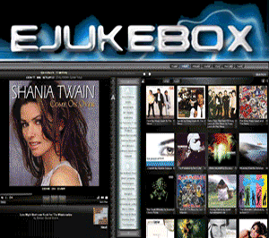
timmyotoole, one issue I have with your mockup is that the wide borders between each area are kind of space-wasting. Don't get me wrong, its a nice look, but I already find things kind of tight in that Home Page view. Things I'd like to see: 1.) Alternate color schemes - this shouldn't be that difficult to do (I recall the brief attempt at "skins" in one recent version, but it didn't go far enough because it didn't change anything except the album view. At minimum, I'd like to see a red/white/black scheme (current blue as red, current black as white, current white as black, with white text however....) and maybe also silver/black and some kind of tan/brown scheme as well. 2.) Slightly better use of Expanded view, at least on the Home page view. Use that extra space somehow. 3.) Better use of the Queue list area, when the queue is empty. The unrelieved black (or whatever color it becomes in another scheme) is uneccessary. Best case? Maybe MORE than one Autoplay prediction? Otherwise, maybe just some background graphic (a nice graphical representation up and down it that says "Playlist" or something similar? 4.) Yes, more defined borders between the parts of the Home Page. Just not as thick as timmyotoole's version, as nice as it is. The "Top Songs By Rating and Playtime" is REALLY nice though. Pretty much perfect aesthetically, except that in real life I'll bet that the ratings all are pretty close for the top 5 songs. :-) Perhaps the idea could be tweaked somehow to show the highest rated songs played during a certain period? Instead of the SAME period as everything else on that Home Page (which could be as long as "Month" or "Forever", maybe it could be something like "out of the last X songs played", with X being a pull down? Or is that too complicated?
Disable Smilies?
Use signature?
Turn BBCode off?
! Delete this message !
Attachment:
Audiosoft Forums
»
Spread EJukebox
»
eJukebox Skin / Interface Design
» Edit Post
Audiosoft Home
|
Download EJukebox for Windows
|
Register EJukebox
©2019
Audiosoft Network
. All rights reserved.
[queries:
17
]
HTML5 Color Picker for CSS Opacity
Short Url Service with Stats